The timeline view must (would be great if it could) be reworked to provide a clear overview of items that have been worked on or are currently active, facilitating easy review and retrieval of recent documents and files.
Functional Requirements
-
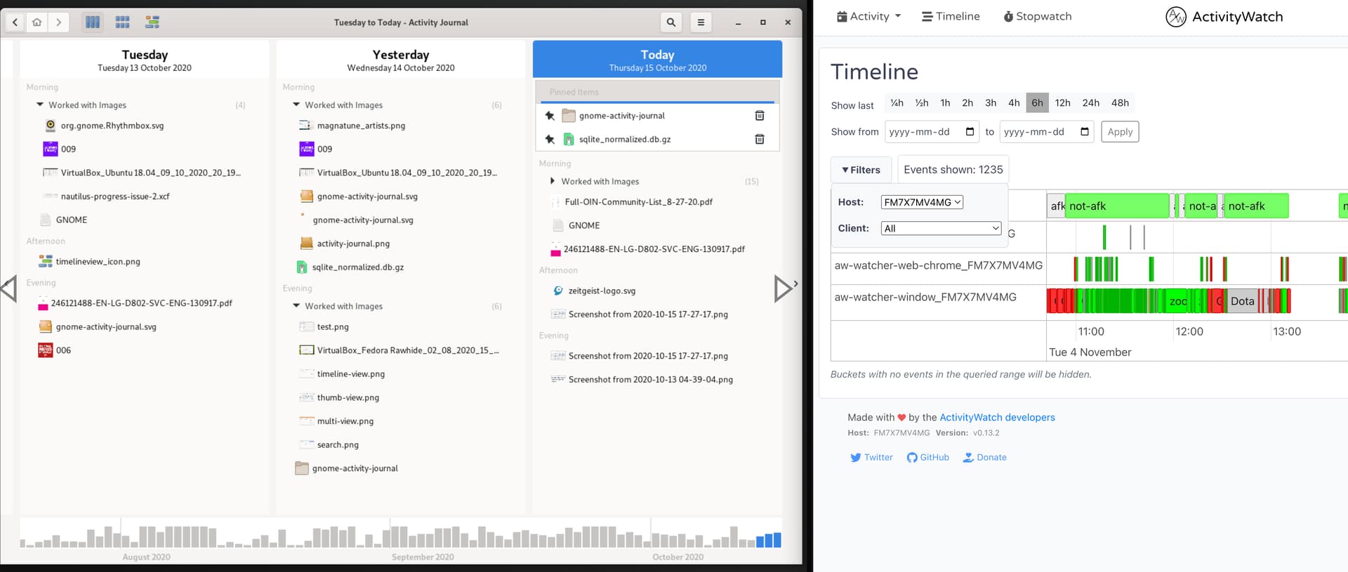
Display timeline items in a vertically-oriented structure, listing days from top to bottom, similar to GNOME Activity Journal 1.0.
-
Show each day as a separate section with associated activity items grouped underneath, using clear headings and concise labels for each event or file.
-
Enable users to scroll through days efficiently, allowing rapid access to past activities while minimizing visual clutter.
-
Support filtering or grouping by day, category, file type, or activity to help users narrow down results and find relevant items quickly.
-
Highlight active or currently open items with distinct, simple visual cues.
UX and Design Requirements
-
Use a clean, minimal layout that prioritizes readability with appropriate spacing, uniform fonts, and only essential details shown per day and item.
-
Incorporate icons or color-coding to help distinguish between event types (e.g., document edit, file access, recent activity).
-
Ensure the timeline design is responsive and works well across screen sizes, especially optimizing for desktop and mobile scroll experiences.
-
Avoid clutter: Do not overload interface with excessive details or controls. Focus on top activities per day for overview while allowing drill-down for more detail.
Rationale
Switching to a vertical timeline reflects workflows observed in GNOME Activity Journal and other modern activity browsers, providing a linear, scroll-friendly experience ideal for browsing past work and tracking active items. This layout makes it significantly easier to revisit earlier dates and identify files/documents previously worked on, thereby supporting user productivity and efficient document retrieval.
GNOME Activity Journal 1.0 to the left in the screenshot, ActivityWatch to the right.