
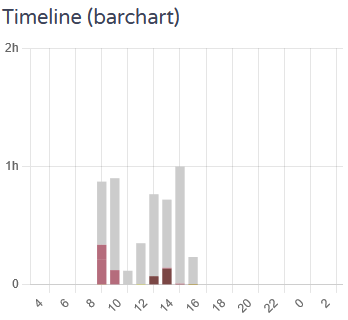
The “Activity” view (http://localhost:5600/#/activity/xxx/day/2023-11-20/view/summary) by default features a small barchart:
I have two suggestions for this visualization:
- The horizontal axis should be adjusted to display only hours where data has been recorded (for the example above this would be from 8 to 17).
- The vertical axis should be adjusted to the width of the bins (if each bar represents 1 hour, then maximum value on the vertical axis shoud be 1 hour).